Data Stories
2020 & 2021
Data Stories is an annual exhibition hosted by Central European University’s Department of Networks and Data Science that celebrates the role of data visualization in research across disciplines. The event combines a curated poster exhibition with expert keynotes and interactive discussions, offering a space for researchers, designers, and artists to share aesthetic and engaging narratives to highlight the power of data visualization.
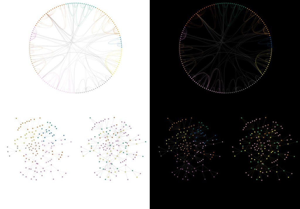
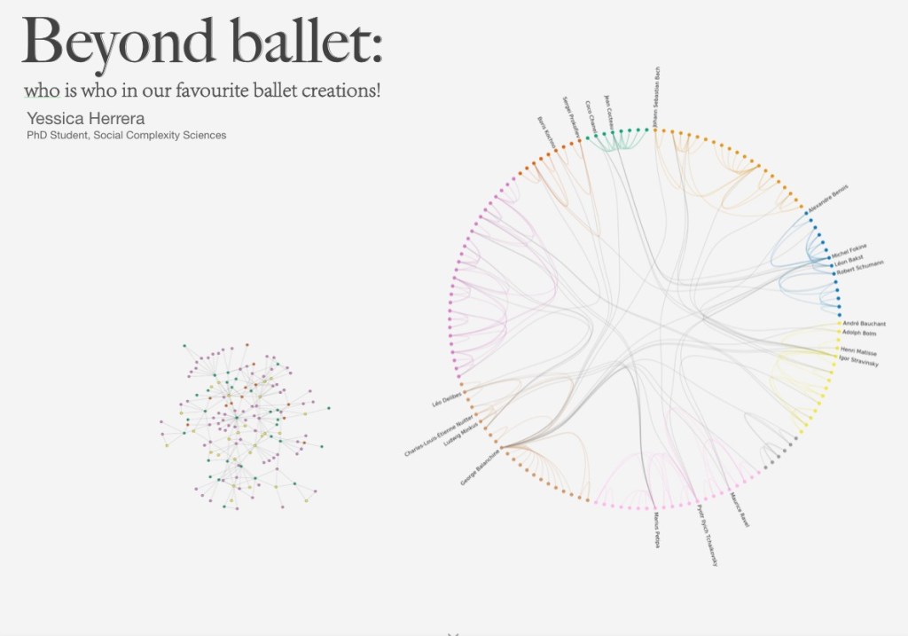
I participated in Data Stories in both 2020 and 2021, taking the opportunity to explore the creative potential of data science beyond academic writing. In 2021, my Data Story was titled “Beyond Ballet: The Leading Creators of Our Favorite Ballets”, I began with a simple question about leadership in the performing arts. But the heart of the project wasn’t the topic: it was the process of translating raw, structured data into a visual story that could speak to a broader audience. I used Wikidata to build a collaboration network of ballet creators—choreographers, composers, librettists, and costume designers—and applied network metrics to identify influential figures. While the data processing was straightforward, the challenge was in designing a piece that communicated clearly and beautifully.
First, I tested different background colors, trying not to lose the network details that reveal patterns of ballet collaborations. Since I wanted to emphasize the connections, I explored solid tones like white and black, but decided for a soft gradient in gray that highlighted the colors of the network.
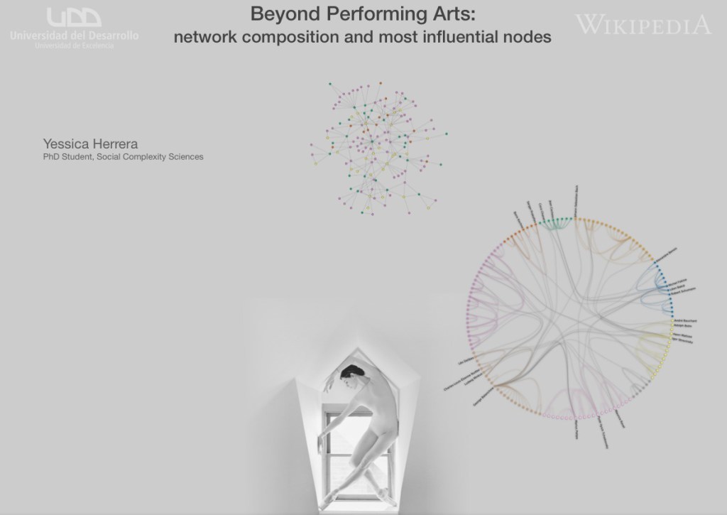
The work became a creative exercise in visual thinking. I selected the networks most worth showing, refined the color palette to distinguish different artistic roles, and tested multiple layouts to improve clarity. At one stage, I tried incorporating a powerful photograph by Karolina Kuras, whose imagery has long inspired my visuals. I previously used Kuras’ photo of the ballerina in the pentagonal window for the Postgrad Pitch competition at the UDD.

Although visually striking, the photograph disrupted the balance and flow of the content. I returned to the essentials: organizing the information first, experimenting with minimalist backgrounds, and refining typography and layering.
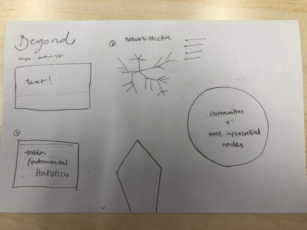
I did not give up on the idea of including a photograph of a ballerina in the poster. Yet I thought that I should first organize the information and data I wanted to convey, then take care of the extra aesthetic elements. I worked in simple solid background, managed different typographies and put everything in the right order.
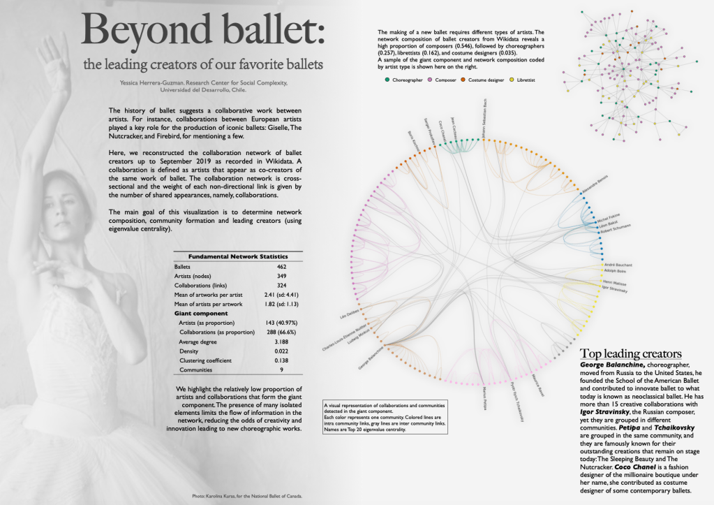
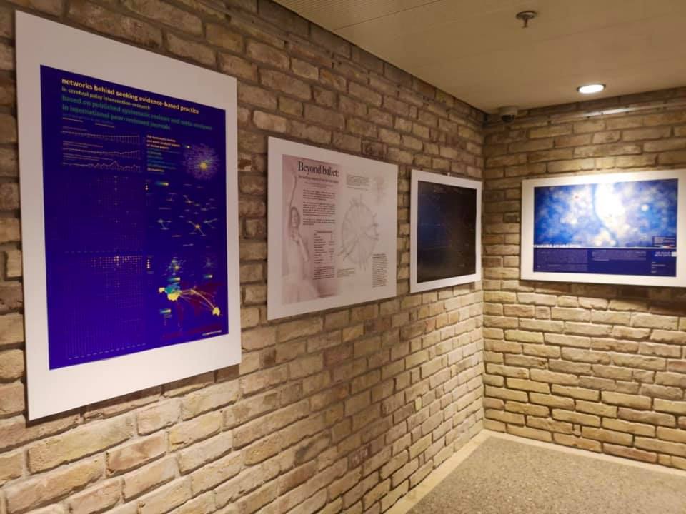
Later, I explored different color combinations to make this data story more appealing. I selected another photograph from Karolina’s professional portfolio to convey the beauty and subtlety of ballet. The final work was minimalistic, I used clean gradients, thoughtful composition, and subtle visual elements. My poster was exhibited at seventh edition of the Data Stories, Research Visualization Exhibition at CEU Budapest. Part of this project was also accepted to be virtually presented at the WikiWorkshop during The Web Conference 2020, Taipei. More details on the making of this work, here.


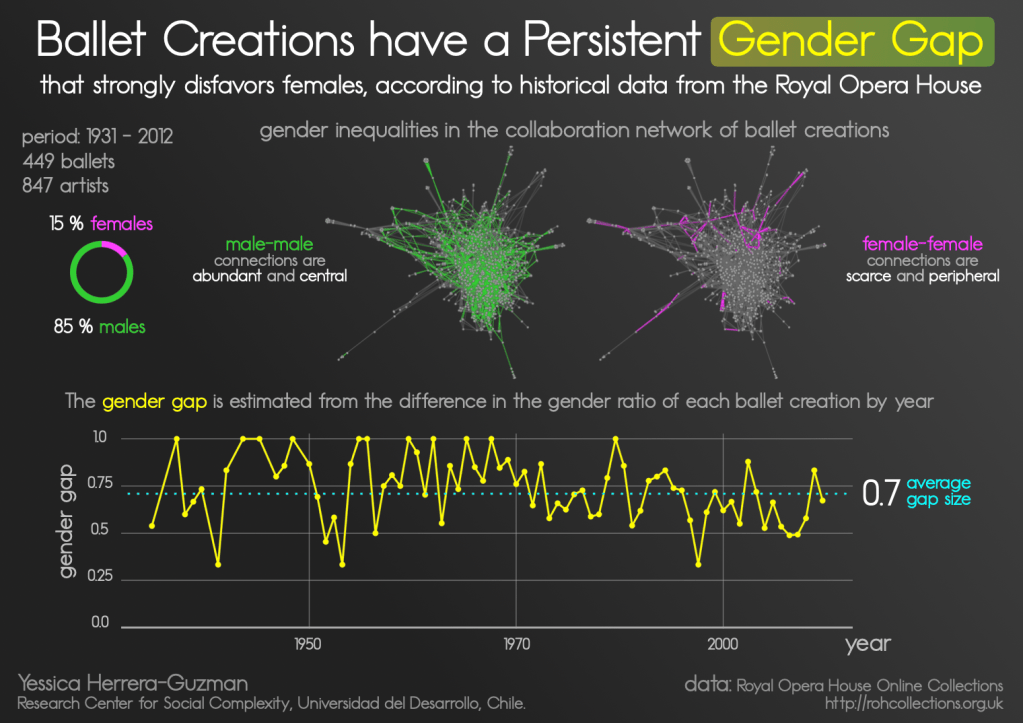
In 2021, I created a second Data Story titled “Ballet Creations Have a Persistent Gender Gap”, where I used historical performance data from the Royal Opera House. This piece was deeply shaped by the aesthetic principles I learned during the Information is Beautiful workshop, led by best-selling author and data designer David McCandless. His concept-driven approach to data storytelling inspired me to design with more clarity, emotion, and structure. The result was a clean, impactful visual narrative grounded in gendered collaboration data in ballet. As part of the Data Stories program that year, I also gave a short oral presentation to share my design process and emphasize the importance of using color-blind friendly palettes, a recurring signature in my work.